









Cuando queremos utilizar herramientas de Facebook como el inicio de sesión de Facebook Social … o cuando queremos crear aplicaciones para la plataforma, necesitaremos contar con un ID de aplicación y una clave secreta.
Estos datos se consiguen a través de Facebook Developers y son los que permitirán la interacción con su API.
Para obtener los tuyos basta con seguir este paso a paso:
[tip_loopeando2]Para crear un ID de Facebook necesitarás contar con una cuenta en la red social. Pero esta cuenta no puede ser de tipo empresa, celebridades, ni contener nombres ficticios. Ha de ser una cuenta personal con datos reales.[/tip_loopeando2]- Accedemos a WeDevelopers de Facebook
- Nos logueamos con nuestra cuenta de Facebook pulsando en “Entrar”.

- Hacemos clic en “Mis Aplicaciones” > “Crear una Aplicación”

- Cumplimentamos los datos y pulsamos en “Crear identificador de la aplicación”.

- Esto nos enviará al Dashboard, donde ya podremos acceder al ID de Aplicación.

- Si necesitásemos también la Clave Secreta, debemos ir a “Configuración” -> “Información básica”
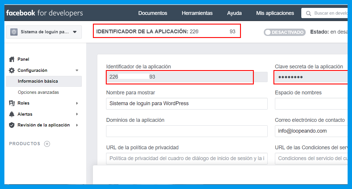
¡Y eso es todo!





Our library is arranging volunteer portraits, and I have been asked to suggest a background that works with different outfits. People will bring their own clothes, so a strict list of approved colors would make the afternoon unnecessarily complicated. A pale blue backdrop is available, although I cannot tell whether its reflected color would influence how faces appear. The camera settings and lighting would stay consistent while we compare a few fabric samples before deciding. For the separate question of personal clothing colors, I noted color analysis quiz for an initial discussion while we work out the practical portrait arrangements. Is it more practical to test the intended clothing first and choose the background afterward? Any manageable way to compare the options would be welcome, especially one that allows people to keep their own style. We can ask several volunteers to take part in that first comparison.
My old glasses need replacing, and I am trying to narrow the frame colors before visiting the optician again. The same frame comes in dark brown, clear grey, and muted red, with very similar measurements in each version. Most of my wardrobe is simple, which makes this feel like a more visible decision than buying another scarf. While reading about ways to compare those options, I found personal color analysis but I need a practical way to use that information when trying the frames in person. Should the first comparison be fairly neutral, followed by another check with the clothes and makeup I usually wear? A friend can help me compare them, but photographs may be less useful than seeing the frames directly. What signs would you look for when two colors both seem acceptable, and comfort is already equally good?
I am preparing to sew my first tailored jacket. I would rather resolve the color question before placing a large order. The supplier offers small swatches, although each piece is much smaller than a collar or lapel. I am considering moss green, plum, and a medium grey. Each option fits reasonably well with my existing wardrobe. I have enough time to order samples before the sewing class starts. My main concern is that texture and the amount of visible fabric could change my impression once the jacket is actually assembled. I have read about how to find my color palette but I still need a practical way to judge these particular fabrics. Can such small samples reveal much about a color near the face? A plain cloth behind the swatch might make comparisons easier. I would also compare them with the lining and buttons. What order of checks would you use before committing to the fabric?
Shopping through used clothing listings has made me realize how inconsistent descriptions of fabric colors can be. I want a short reference list that helps me search without turning every purchase into a research project. Knowing a season alone may not solve the problem when listings offer only very broad color descriptions. The reference I am considering as a starting point is my color palette and I want to connect that vocabulary with descriptions a seller might actually use. For example, a note that distinguishes a dusty blue from a vivid blue might help more than a long list of names that never appear in the descriptions sellers write. Would you record depth, softness, and warmth separately, or choose a few familiar examples instead? I can compare a purchase with clothes I already own, but online photographs remain an uncertain guide. What would you include in a compact reference that is actually useful during a secondhand search?
“Choose your face shape” is the opening instruction in a reader activity I am editing. At the moment, the descriptions for oval and oblong overlap enough to leave me unsure what to change. I would rather improve the question than pretend there is an exact boundary everyone will recognize. I have bookmarked oval vs oblong face shape as a comparison reference for the revision. Would it be better to ask about visible proportions before introducing the category names? We could offer a not sure option and explain that the activity is a rough description. I also want to remove wording that suggests one outline is more attractive or more normal. A simple outline diagram is possible, but it would need a specific and useful caption. Which part of the question would you revise before adding more possible answers?
I am helping edit a beginner illustration glossary, and we disagree about how much detail belongs in the face outline section. One draft lists category names without explaining the observations behind them, while another gives so much detail that the distinctions disappear. A reference about determining face shape might help us decide which observations belong in each entry. I would like every definition to follow the same order, moving from overall length and width to the outline of the jaw. That would let readers compare descriptions directly, rather than assume that a single distinctive feature settles the classification for every face. We also need a short note explaining that intermediate outlines can be described without inventing a new category for each example. For the diagrams, I would use simple line drawings at the same scale and leave hairstyle details out of the comparison. We want neutral descriptions that support observation, without presenting a particular outline as the standard that every portrait should follow. Which details are essential in a beginner glossary, and which would you move into a separate explanation with more examples?
While cataloguing family photographs, I have started keeping brief notes about the people pictured. A few relatives appear repeatedly, but their ages, expressions, and poses vary across the photographs. I can describe the jaw or forehead separately, yet I hesitate to assign one face shape label. I saved a face shape test to help me think about the terminology. I would use that only as a vocabulary prompt, since an old photograph can hide important details. In some pictures the forehead is hidden by hair, and in others the jaw disappears into shadow. Each entry would record the date and viewing angle before offering a cautious description of facial proportions. If two photographs suggest different categories, I would rather preserve that uncertainty than silently choose one. Has anyone developed a simple way to record this kind of uncertainty in a family archive?
Our family photo archive needs clearer notes about how portraits were taken. Even nearby shots sometimes make one face look longer or wider. I want to compare the visible face outline without treating a photograph as a precise measurement. For background on the terminology, I saved face shape as a terminology reference. The actual comparison also needs information about camera distance. The notes would cover head position, crop boundaries, and hair obscuring the outline. For a fairer comparison, I would choose pictures with similar framing before discussing proportions. I would keep the original files and place these observations in separate notes, so another family member can revisit the comparison. An uncertain outline label should remain provisional, especially when the two pictures differ in pose or when part of the jaw is hidden. How would you document uncertainty without making the notes difficult to read?
For our next discussion, I chose the idea that every facial outline has one unambiguous label. I am skeptical because a slightly longer outline does not suddenly become a completely different object. A useful example would show why two observers might describe the same outline in different ways. We might start with separate observations of facial length, cheekbones and the contour of the chin. One possible starting reference is face shape calculator for the vocabulary involved. It would serve as a discussion prompt rather than evidence that a particular category must be correct. We should also keep the image fixed so a different pose does not distract from the classification question. Which question would best reveal whether the proposed categories allow reasonable disagreement? I want the discussion to leave room for useful descriptions as well as honest uncertainty. Participants should explain which visible features support their interpretation.
My new identification photo makes my natural brown hair look distinctly reddish, although I have not dyed it. My mirror at home shows a different shade. Photos taken outside show a more neutral brown. I am trying to work out whether the difference comes from the light, the camera, or the printed photograph. I found hair color analysis while searching for better language to describe what I see. I do not need a new dye recommendation. A small controlled comparison seems more useful than a transformation. Would you take a fresh picture beside a neutral background and compare it with an unedited daylight image? Both pictures can be taken without filters. Matching the framing should be straightforward. The print is the part I find hardest to explain. What would you check first? I would like to know whether a retake is worth requesting before assuming my everyday view of my hair is wrong.
My saved hair color pictures have become confusing because the same shade names appear under very different examples. Indoor light changes the appearance in some examples, and several others clearly have heavily adjusted colors. My next step is to organize visible differences rather than trust every caption attached to a picture. I kept cool summer hair color ideas as one search category, although the label alone does not settle which photos belong together. For each image, I am noting whether the result appears lighter or darker than the visible roots. I also keep a separate note when the lighting makes the warmth of the shade difficult to judge. I preserve the source wording separately, since changing the label should not make the original image untraceable. A handful of well-described references would be more useful to me than a huge unsorted folder. How do you describe hair color references when the captions are inconsistent and the lighting varies?
I am putting together a costume with a removable fringe, and matching it to my own hair is proving awkward. The product pictures use bright studio lighting, while my reference photographs were taken beside a window. The brown labels cover a surprisingly wide range, from golden looking samples to much cooler ones. I came across a reference for hair color analysis and would like to describe the mismatch more precisely before requesting additional sample photos. Is matching depth a useful first step before trying to judge the warmer or cooler cast? Because the piece touches my own hair, even a modest difference could stand out at the join. The costume will be worn indoors, so I would also compare the sample in that room. A sample swatch is an option if another round of photographs does not settle the choice. If you have matched a fringe or extension, what helped you judge the color at the join?
Instead of coloring my hair again immediately, I am documenting how the natural growth looks beside the dyed lengths. The older color on the lengths makes it difficult to describe what is happening near the roots. The point is to record what changes rather than decide on a final color from one photograph. To help describe the transition, I bookmarked hair colour analysis and began separating observations about roots from observations about the older dye. My idea is a monthly photograph in the same place, plus a closer picture of the roots. I would also note whether the hair is wet or dry, since I do not want to compare unlike conditions. I would like to review the record over several months, with dates and consistent descriptions that make small changes easier to follow. What would you record to make the diary useful later without turning it into a complicated photography project?
We are preparing for my teenager’s first consultation about layers. The reference pictures all show a bouncy finish, but the everyday routine is usually a quick wash followed by letting the hair dry on its own. I would like the stylist to explain the routine clearly. The decision should still belong to the person wearing the haircut. One useful question came from looking up butterfly haircut maintenance since the styling steps matter as much as the picture. We could ask to see how the layers fall without a blowout. We also need to ask about tying the hair back for school. A manageable routine would make the decision clearer. There is no need for the result to match a picture exactly. We can take notes during the appointment and ask which steps are optional. That would make it easier to distinguish ordinary care from styling for a special occasion. What would you include in a short maintenance checklist for that appointment?
I cycle to work and usually arrive with my hair flattened under a helmet. I am considering a fringe, but the maintenance matters more than a perfect salon photograph. My current hair reaches my shoulders. My morning routine leaves little time for styling. I have been looking at curtain bang lengths because I want to discuss actual lengths with my hairdresser rather than point vaguely at an attractive picture. I would prefer pieces that tuck behind my ears. I normally wear a loose centre part. I know a virtual image will not reproduce helmet pressure or show how my own hair dries, so I would treat it as a conversation aid. Has a similar cut worked with your cycling routine? The less polished days matter to me too. Brushing it briefly is an option. Regular heat styling would be harder to maintain.
For our next drawing workshop, I want to start with the outline of short hair rather than detailed texture. The recurring difficulty is that texture attracts attention before anyone has looked carefully at the overall outline. I want to use a few reference cards with different front sections, side shapes, and visible areas around the ears. The short haircut reference I am starting with is pixie haircut and I would welcome other useful references. I would keep the discussion focused on visible shapes rather than asking participants to judge anyone’s appearance. We could trace the outside shape first, then compare where the hair overlaps the forehead and where it leaves open space. Texture would come last, with a small number of marks chosen to support the shape already established. How would you phrase a few short prompts that keep attention on silhouette before texture?
My blunt fringe is growing out, and the current length is difficult to arrange. Some sections skim my cheekbones and others remain noticeably shorter. I have been looking at blonde hair with curtain bangs for ideas about the outline, although the photographs rarely explain the transition between cuts. I would like the front to blend into the rest without losing much length. A slightly uneven centre part seems to be where my hair naturally falls. I can shape it with a brush, though I would rather avoid heat every morning. Would you tidy the side sections at this stage or let everything catch up first? I will show the hairdresser how the front sits without a styled finish. I usually wear the rest of my hair loose, which makes the difference between the short front pieces and the longer sides quite noticeable. Hearing how others handled the in-between length would help me decide what to ask for.
For an upcoming theatre production, I have been asked to collect practical hair references for a single character. The character needs a curtain fringe on blonde hair, with enough space around the face for expressions to read. My reference folder uses photographs, since written haircut descriptions alone leave too much room for misunderstanding. To make the discussion clearer, I am using blonde hair with curtain bangs as a reference. The main question is whether to use the actor’s existing fringe or discuss a removable hairpiece with the costume team. There are two quick costume changes, so a style that needs careful resetting after every scene would be awkward. I plan to bring front and side photographs to our rehearsal and check how the shape looks under stage lighting. Which practical details should we put on the styling sheet so different backstage helpers can follow the same reference?
The costume team for our community performance has asked me to shortlist a few recognisable wig styles. We need a layered silhouette that remains visible under stage lighting without covering the performer’s eyes. I have been gathering reference pictures under the heading avril lavigne hairstyles for this project. It is hard to tell how much of the outline comes from layers rather than daily styling. The performer changes costume twice, so anything requiring a fresh restyle between scenes seems unrealistic. I would like to keep the wig comfortable and avoid trimming it until we have tested the outline. I would appreciate hearing how others chose the essential features when adapting a photographed style for a stage wig. We also need to check that the wig stays secure when the performer turns quickly and moves between the wings and stage. Practical suggestions for keeping the front sections stable would help us prepare for the next rehearsal.
A jacket fitting exercise has left me with questions about how body type advice translates into actual pattern changes. The cotton sample stands away from my waist, while a softer version of the same pattern hangs much closer. Some classmates describe the result using proportions, while others immediately reach for a named style category. Before assigning myself a category, I would prefer to record what actually changes between the samples. The reference I am considering covers body shape and colour analysis and I would use it to organize questions before bringing them back to class. Would you compare shoulder placement, hem length, or fabric weight first when the basic pattern remains the same? My aim is a useful fitting record that explains each alteration instead of merely attaching a type label. Photographs of each sample under the same conditions should make the comparison easier to explain during the next lesson.
I am helping catalogue the clothes in our amateur theatre wardrobe. Two coats fit the same actor yet give completely different impressions. I would like to understand how style systems describe those visual differences. I saved a reference on color and body type analysis as a starting point for the discussion. We need a practical catalogue that lets the next volunteer compare pieces without guessing. My notes would separate sleeve structure, fabric movement and the position of the waist seam. I do not want costume labels to become permanent descriptions of the actors. The notes also need to work when a replacement actor borrows the costume, so I want observations that remain attached to the garment. Is there a useful way to translate body type vocabulary into observable garment details? An example involving one jacket would help more than a long list of labels.
I am helping organise the jacket rail for an upcoming amateur theatre production. The same jacket size produces noticeably different lines on different performers during a quick try on. Our fitting notes should describe shoulder lines, waist placement and balance without ranking anyone’s appearance. We can keep a separate note for each performer and costume, including movement restrictions observed during rehearsal rather than assumed from appearance. Body type systems might offer some vocabulary, but I do not want their labels to become casting rules. I bookmarked the following reference while preparing our fitting discussion: color and body analysis We can compare photographs of the garment with permission, using the same distance and a relaxed stance. Before coordinating colours, we need to check that each jacket allows the movement required on stage. What vocabulary would you suggest for useful fitting notes that leave room for personal preference?
Our neighbourhood group is preparing a clothing exchange. We have jackets, skirts and trousers in several sizes, and the usual size labels tell only part of the story. There is a mixture of fitted pieces and loose silhouettes. I came across body shape and colour analysis while looking for ways to describe these differences. We want useful descriptions without assigning guests a body category. A note about shoulder construction might be helpful. Waist shaping and fabric weight might belong on the cards too. Guests would still be free to try any section. Specialist body typing terms might make a friendly event feel restrictive. We will have a mirror and a changing area, but volunteers cannot give personal styling consultations. Any labels need to make sense quickly and help visitors decide what they would like to try. How would you describe silhouettes on a small information card?
After sewing a trial pair of trousers, I have more questions about proportion than expected. Although the waistband feels right, the silhouette is quite different from what I pictured. Discussions about body types keep distracting me from checking the actual seams and fabric. I have been looking at body shape and colour analysis to understand the vocabulary, but I still need a practical order of checks. Should I first check that the seams hang straight before deciding whether I like the width? I can compare the mock-up with a comfortable pair that I wear regularly. My practice fabric has less drape than the intended fabric, which could change the silhouette. I would rather adjust one feature at a time and keep notes than chase a label. How do experienced sewists distinguish a construction problem from simply preferring another silhouette?
My next work event includes a panel with no lectern. The speakers will remain seated while taking questions. My full length mirror gives me only part of the picture. I have been reading about color and body type analysis while trying to understand how different style systems describe proportion. I would like to use the vocabulary to compare outfits without treating a category as a rule for every situation. The jacket hem looks different when I sit down. Ease of movement matters while handling notes and a microphone. I could record a short seated rehearsal in each outfit. I would keep the camera position consistent for the comparison. The event photographs may show us from the side as well as the front, so I want to consider both views before making a decision. What would you look for before choosing between the outfits?